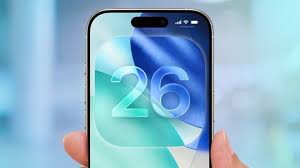
With the release of iOS 26.2, Apple is making a quiet but significant course correction. The latest update introduces a new, user-controlled slider to adjust the transparency of the Lock Screen clock, marking the second time in as many updates that Apple has provided tools to “roll back” the visual effects of its ambitious Liquid Glass design language. This move, coupled with a major shift in its human interface design leadership, signals a pivotal moment for Apple. The company is moving from a stance of rigid design authority to one of unprecedented user customization, fundamentally asking: in the pursuit of futuristic aesthetics, should the user’s comfort and clarity ever be compromised?

This article will delve into the specifics of the iOS 26.2 update, unpack the mixed reception of the Liquid Glass overhaul, and analyze how Apple’s responsive tweaks—and the executive change behind them—telegraph a new, more flexible philosophy in Cupertino.
The Headline Feature: Gaining Control Over the Lock Screen Clock
The centerpiece of iOS 26.2 is a new customization option for the Lock Screen. Users can now find a slider that directly controls the “glassiness” or transparency of the clock. This tool allows individuals to dial the clock back from the full, semi-transparent Liquid Glass effect to a more opaque, “frosted” appearance that improves readability against complex wallpapers.
This is not merely an aesthetic tweak; it’s a direct solution to a common user complaint. Since the debut of Liquid Glass with iOS 26, many users found that key interface elements, particularly against certain backgrounds, became difficult to distinguish. The Lock Screen clock, as one of the most frequently glanced-at components, was a prime offender. By decentralizing this design decision and handing control to the user, Apple is acknowledging that universal design rules cannot account for infinite personal wallpaper choices and visual preferences.
Liquid Glass: A Vision for the Future That Strained the Present
To understand the importance of this rollback, we must revisit the vision of Liquid Glass itself. Introduced as the cornerstone of iOS 26’s visual identity, Liquid Glass was a bold redesign meant to modernize Apple’s operating systems. It transformed static buttons, sliders, notifications, and other UI elements into semi-transparent objects that subtly refracted light, mimicking the optical properties of actual glass.
The intent was multifaceted:
- Modernization: To move beyond the “flat design” era that had dominated for a decade.
- Depth and Realism: To create a more tactile, layered, and spatially coherent interface.
- Future-Proofing: Widely interpreted as preparatory work for augmented reality (AR) and AI smart glasses, where UI elements would need to exist as believable objects in a three-dimensional, blended world.
However, the execution met immediate friction. The very transparency that created a sense of elegance and depth also reduced contrast and legibility. Users reported issues reading notifications, identifying buttons in Apple Music, or quickly telling the time. The design that was meant to feel futuristic and light often felt frustrating and impractical in daily use. The principle of “form follows function” seemed, to some, to have been inverted.
A Pattern of Response: Apple’s Iterative Retreat
The Lock Screen clock slider in iOS 26.2 is part of a clear pattern. It follows the release of a broader Liquid Glass opacity tool in iOS 26.1, which introduced a system-wide setting to reduce the transparency of all Liquid Glass elements. This two-step rollback is highly revealing.
It demonstrates that Apple is treating user feedback on Liquid Glass not as noise to be ignored, but as critical data to be acted upon. The company is methodically addressing pain points: first with a global fix for the entire system in iOS 26.1, and now with a granular, element-specific control in iOS 26.2. This iterative approach shows a software development philosophy that is increasingly agile and user-responsive. It telegraphs that Apple is not standing dogmatically behind Liquid Glass “as is,” but is willing to refine and adjust it—even publicly and repeatedly—to better serve its audience.
The Human Element: A Changing of the Guard in Design Leadership
The timing of these software adjustments coincides with a major personnel shift that cannot be overlooked. Earlier in December, Apple confirmed that Alan Dye, the company’s Vice President of Human Interface Design and the executive widely credited as the driving force behind the Liquid Glass aesthetic, was leaving Apple to join Meta.
Dye, who reported directly to CEO Tim Cook and was a key successor to the legendary Jony Ive, embodied a certain philosophy of top-down, meticulous, and sometimes uncompromising design. His departure, while not framed as a dismissal, creates a natural inflection point.
He is succeeded by Stephen Lemay, a longtime Apple designer with a deep background in interface and interaction design. Lemay’s career has been focused on the functional mechanics of how users navigate and manipulate software—the very “usability” aspects that Liquid Glass was criticized for undermining. This leadership change strongly suggests a strategic pivot. Apple appears to be re-balancing its design priorities, placing a veteran expert in user interaction at the helm to potentially mend the rift between Liquid Glass’s artistic vision and its practical utility.
Beyond Liquid Glass: Other Key Features in iOS 26.2
While the Liquid Glass adjustments are the most symbolically loaded, iOS 26.2 is a substantial update packed with other meaningful enhancements:
- AirDrop Codes: This new feature solves a long-standing friction point. Users can now generate a QR-like code to share with others, making them a “known” AirDrop contact for a 30-day period. This is ideal for professional collaborations, event photography, or any situation where you need to share files securely with someone not in your contacts.
- Enhanced Reminders and Apple News: The Reminders app gains support for alarms, making it more competitive with dedicated to-do apps. Apple News receives a navigation overhaul with a new “Following” tab for easier access to favorite topics and channels.
- Apple Music and Podcasts Upgrades: Apple Music now supports offline lyrics, a boon for travelers, learners, and karaoke enthusiasts. The Podcasts app receives significant AI-powered boosts, including AI-generated chapters for easier navigation of long episodes and a “Podcast Mention” feature for linking to related shows.
- Apple Watch Sleep Score: WatchOS updates bring a new Sleep Score to the Sleep app, providing a quantifiable metric based on sleep duration, consistency, and quality goals.
- Critical Security Patches: As always, user safety is paramount. iOS 26.2 includes several important security updates across Apple’s product line to patch vulnerabilities being exploited in active hacking campaigns.
Analysis: What This Means for Apple and Its Users
The story of iOS 26.1 and 26.2 is more than a tale of two sliders. It represents a potential cultural shift within Apple’s hallowed design studios.
- The End of “Father Knows Best” Design: For years, Apple’s philosophy was that its designers, through intense study and taste, knew what was best for the user. This update cycle suggests a softening of that stance. By offering controls to revert a flagship design change, Apple is embracing a more collaborative, democratic relationship with its users. The message is clear: your comfort and ability to use your device effectively are paramount.
- Preparing for an AR Future, But at a Manageable Pace: The Liquid Glass design makes profound sense for a glasses-based AR interface where digital objects must blend with the real world. However, iOS 26.2 shows that Apple understands this vision cannot be forced on today’s 2D smartphone screens at the expense of usability. The company is willing to pump the brakes, allowing users to adapt at their own pace while the underlying technology for glasses matures.
- Flexibility as a Feature: Granular customization was once the domain of other operating systems. Apple’s introduction of these precise controls reframes flexibility as a premium feature. It’s no longer about choosing between Apple’s way or no way; it’s about Apple providing a beautiful, opinionated default that you have the power to tailor perfectly to your needs.
Conclusion: A More Mature and Responsive Apple
The release of iOS 26.2, with its focus on user-controlled transparency, marks a mature and pragmatic turn for Apple. It demonstrates that even the world’s most valuable company, with its unparalleled design resources, is not immune to missteps in taste versus function. More importantly, it shows a company that is learning to listen and adapt with remarkable speed.
The combination of iterative software fixes and a leadership change toward interaction design expertise suggests Apple is recalibrating. The goal remains a breathtaking, forward-looking interface—likely for the glasses-bound future we’ve long been promised. But the path to that future is now being paved with a new material: user choice. In the end, iOS 26.2 isn’t just about making the clock easier to read; it’s about Apple refining its vision to ensure that as its designs become more transparent, its relationship with its users becomes even clearer.
- Reddit’s Strategic M&A Shift: Adtech and AI Acquisitions
 Reddit’s Bold New Direction In a revealing fourth-quarter earnings call that has sent ripples through the tech investment community, Reddit’s leadership announced an aggressive new mergers and acquisitions strategy aimed at accelerating growth and enhancing monetization. Chief Financial Officer Andrew Vollero outlined a dual-pronged approach, signaling the social media platform’s intent to acquire businesses that… Read more: Reddit’s Strategic M&A Shift: Adtech and AI Acquisitions
 - TikTok’s Privacy Policy: “Immigration Status” Collection?
 Executive Summary A recent update to TikTok’s privacy policy following its ownership change has sparked significant alarm among U.S. users, particularly over language stating the app may collect “citizenship or immigration status.” This concern is heightened by the current political climate surrounding immigration enforcement. However, a closer examination reveals this disclosure is not new and is primarily a legal compliance… Read more: TikTok’s Privacy Policy: “Immigration Status” Collection?
 - Apples market explodes in India
 Executive Summary In a remarkable display of strategic growth amidst market stagnation, Apple’s iPhone achieved its strongest year ever in India during 2025, shipping approximately 14 million units and capturing a record 9% market share. This exceptional performance occurred against the backdrop of a broadly flat Indian smartphone market that has remained stagnant at 152-153 million units for four consecutive… Read more: Apples market explodes in India
 - Gemini’s Personal Intelligence Beta: Your AI Assistant Just Learned to Read Your Emails, Photos, and Mind
 For years, the promise of a truly personal AI assistant has been just that—a promise. We’ve had chatbots that can retrieve information and models that can generate text, but a digital companion that proactively understands the context of your life, your memories, and your preferences has remained elusive. That changed on Wednesday, January 14, 2026,… Read more: Gemini’s Personal Intelligence Beta: Your AI Assistant Just Learned to Read Your Emails, Photos, and Mind
 - Subtle’s AI-Powered Earbuds Are Here: A Deep Dive into the Future of Context-Aware Audio
 Introduction: The Day Personal Audio Grew a Brain The true wireless earbud market, valued in the tens of billions, has long been a battleground of incremental upgrades—slightly better battery life, marginally improved driver clarity, or a new shade of white. On January 4, 2026, tech startup Subtle shattered this cycle of predictability with the launch of its flagship… Read more: Subtle’s AI-Powered Earbuds Are Here: A Deep Dive into the Future of Context-Aware Audio
